Sunday, June 27, 2010

Warm Colors, Cool Beach

Woo-hoo! For me, summertime is scrapbooking season. Summer vacation allows me two things - time to have a life and time to scrap it. During the school year, we don't do a lot, and what we do, I tend to digi scrap so as not to get hopelessly behind. (I like digi-scrapping! I've picked up some pretty cool stuff at Two Peas and The Sweet Shoppe, among others.)

I was surprised not too long ago when my going-to-middle school son, AJ, asked about the pictures froma particular event and if I would "scrapbook it by hand." I didn't think it made a difference to him. I was wrong.

So, anyway, it's time to get with it again, and a couple of challenges at some of my favorite cardmaking haunts gave me some inspiration:

This is from our spring break trip to the beach,which, if you're in the Carolinas, generally means Myrtle. The bottom picture doesn't show well - it's AJ's footprints, which, sadly, are looking more and more like mine.

The striped paper is from K and Company. CS is Bazzill. The sandy paper is from the scrap pile. The stamp is one from an {Ippity} set (by Unity) and is stamped in Fired Brick Distress Ink. I also used Tea Dye Distress Ink to touch up the sanded blue CS and the sentiment oval. That's canvas quickly tied into three knots along the bottom. Stickers are Jolee's.

This, I hope, counts as a 'project' for:
The Shabby Tea Room - warm colors/stripes
The Play Date Cafe - brown, turquoise, red, orange

I'm so glad that you stopped by! Please come again  soon!
I hope the start to your week is happy!
Elizabeth 

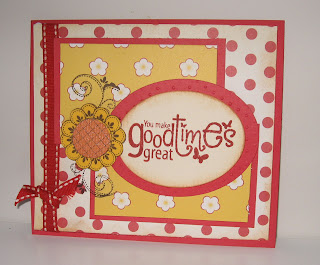
Good Times! (Ain't We Lucky We Got 'Em?)

Okay, so that totally dates me. I was a kid when the show Good Times was on. I didn't understand that theme song then - I was young enough to not wholly 'get' the recession in the late '70s - but now, well, yeah. A lot of us are there.

But, like the show taught, you don't have to have a lot to be somebody and to enjoy those good times. I am lucky to have so many kind friends. This is a thank you for one of them.


This is also for the sketch challenge at Tuesday Morning Sketches.

The sentiment and the flower are from one of my favorite {Ippity} sets. Paper is Cosmo Cricket; CS is Bazzill. I used Tea Dye Distress Ink to touch up the sentiment oval and tone down the white stitching on the ribbon. I ran the red CS backing the oval through the CB with a swiss dots folder before cutting it with a Nestie.

Thank you so much for stopping by today. I hope the rest of your weekend is - say it together now -
DY-NO-MITE!

Elizabeth

Saturday, June 26, 2010

Just a Quickie

Yay, Saturday!

I'm posting quickly as I'm supposed to be fixing dinner, and I'm just sliding in under the deadline at 2S4U (Two Sketches For You). This also goes with The Color Challenge at the One Stop Craft Challenge, pink and brown and the Aud Sentiments Challenge, put the word 'love' on your card.


The stamps are {Ippity} by Unity, the birds are done up with StazOn and the sentiment in white Color Box. Cut the scallops with Nesties. The paper is punched out circles.

Thank for stopping by! Gotta run - porkchops are calling!

Hugs,
Elizabeth

Friday, June 25, 2010

Why Roast at the Pool? We're Crafting in the Cool!

Hey, Friends With Flair! What's up? I don't know about where y'all live, but it's *hot* here, even for the South. We've been pushing 100 daily for more than a week, and it's crazy humid, too! My parents live in the DFW area, where it's been way hot even longer, but their 100 isn't the same as an East coast 100, and I'll take theirs any day!

So, what better excuse to hide in the house and stamp?

My project actually was a FAIL! (as my eleven-year old would say.)  I was putting a card together for color splash challenge at The Play Date Cafe. When I went to drop it onto Mr. Linky, I wondered, "Why did everyone else choose blue?" Then I read the directions more carefully. Duh.

I am crazy about my set of Unity buterflies! They're very detailed and versatile - some are frillier than others and - since I'm on that shoestring - useful in so many situations! With their size, they're also great for scrapbook pages!

The backgrounder is from CHF. The 'fly is inked in  Adirondack Watermelon. CS is Bazzill. I did re-do it in blue, which is a couple of posts down. This one turned out better, though.

Thank you so much for stopping by today! I love to learn from your comments, and I'll look forward to visiting your place, too!

Have a wonderful weekend!
Elizabeth

Wednesday, June 23, 2010

Pretty (for) a Princess

Ah, to be a princess. Did anyone else see that the Crown Princess of Sweden just married her personal trainer?! Really?! I guess times have changed. Which is good - let's face it, to be a princess back in the day was to be a pawn. Women's rights have extended themselves to royalty, and a princess can choose a common Prince Charming with a tight set of abs (and glutes!)

So, it's not surprising that a few challenges have popped up that would go with a princess theme. Here's my offering:


This goes with several challenges:
Paper Sundaes - Pretty as a princess
The Pink Elephant - Pink and Black (I soooo want a pink Ella stamp! Too cute!)
Sketchy Thursday - Well, a sketch.
Caardvarks - Embossing
Bunny Zoe - Nice and Girly (Hey! It's a new challenge blog!)
Bee Crafty - Pink and Girly

The crown is a digital image from Lettering Delights. The letters are Cuttlebug. There is an acetate frame underneath the crown by Colorbok. (It looks funny in the first picture thanks to the flash.) The embossing folder is a QuicKutz,and the CS is Bazzill.

So, this one's for my niece, Carlie, who is our family's princess. She plays her role well.

Here's Carlie getting her way:                                      and  not:


Truth, she's a lot of fun - very worldly, and just a hoot. Takes forever getting dressed for preschool. She's wicked smart, too, and that should make for a very interesting combo. down the road!

Thank you so much for stopping by today! I hope the rest of your week is fit for a queen!
Elizabeth


Tuesday, June 22, 2010

Sonshine!

Good Tuesday afternoon! I worked this morning on an all-purpose card for the challenge at Card Patterns. Really cute sketch! It would be useful for a lot of cards!

Here's my take:
The background DP is from American Crafts. I cut out a couple of small clouds to pop up and make the bellie for the sketch. Tossed on a couple of buttons from Oriental Trading; CS is Bazzill. The verse image is a Plain Jain from Verve.
*Shoestring Alert!* Verve Plain Janes are image singles and are really inexpensive. The good folks over there are kind enough to adjust shipping to the package, so I can snag some lovely stamps without stretching the shoestrings too far!

Thanks so much for stopping over today! Y'all come back!
Hugs,
Elizabeth

Monday, June 21, 2010

A Splash of Blue

Happy Monday! I'm working into that it-doesn't-really-matter-what-day-it-is that is the teacher's summer. If only the cat would figure out that it's OK that the sun is up and I'm not...

The Play Date Cafe had a fun color challenge this week. Black and white and a splash of blue. I had to take a fail at first because I did it with a splash of pink! How many times a day do I say, "Read the directions!"? LOL! So, back to the drawing board, and here it is:
The backgrounder is from CHF. I loooove this Unity butterfly from a set of beautiful 'flies! The sentiment is from Verve. (Gee. That's most of the major companies. Too bad I didn't have a Bella or something from MFT!)
The 'fly is inked with Broken China Distress Ink. I used  Briliance for the black background. Ribbon is grossgrain.

Here's the original. I think I'll save it for Unity FWF this week.

The only difference is that I stamped the butterfly with Adirondack Watermelon and pink CS.

Have a wonderful week! Thank you so much for stopping by!

Elizabeth

Thursday, June 17, 2010

An Explosion for Dad

Yeah, I'm running a little late. In fact, as soon as I finish this, I've got to hustle over to the Post Office to send this little project off to Texas!

It's an explosion box. I saw one on a challenge a few weeks ago and thought it looked like a lot of fun. It is for my dad, so I kept it simple.


The bright DP is from Little Yellow Bicycle. CS is Bazzill.
I used two different digi stamps. The circle on the top is from The Cutting Cafe and the dad and daughter are from Shirley's 2 Girls. I must have gotten the font from Dafont.com , it's called Calvin and Hobbes. The little sun, etc. images are actually Doodlebats from SNF.

This project goes with two challenges:
Just Us Girls - Try a digi stamp. I'm a huge fan of digis. I can afford a lot more stamps!
My Time to Craft - Extra Special. Whose dad isn't?

Thank you so much for stopping by today. Please leave a comment. I love to learn from them!
Have a great week!
Elizabeth